BrokerCloud

Policy Dashboard

Transforming fragmented policy data into a centralized, actionable experience
iPhone mockup

The Problem

Fragmented Access to Critical Information

Insurance agents using BrokerCloud were required to leave the platform to review policy data, often navigating through overly complex and lengthy information.

This created:
  • Disjointed workflows
  • Slow access to key information
  • Difficulty quickly understanding policy performance

Information Overload Without Prioritization

Agents didn’t need access to every detail immediately, they needed:
  • A clear snapshot of performance
  • Quick access to the most relevant information
  • Faster decision-making within their workflow
Instead, the experience forced users to sort through unnecessary complexity to find actionable insights.

Insights

Through early stakeholder conversations and discovery sessions:

Agents didn’t need more data. They needed a clearer, faster way to understand the data that mattered most.

This reframed the project from:
“Build a dashboard” to “Design a centralized decision-making tool.
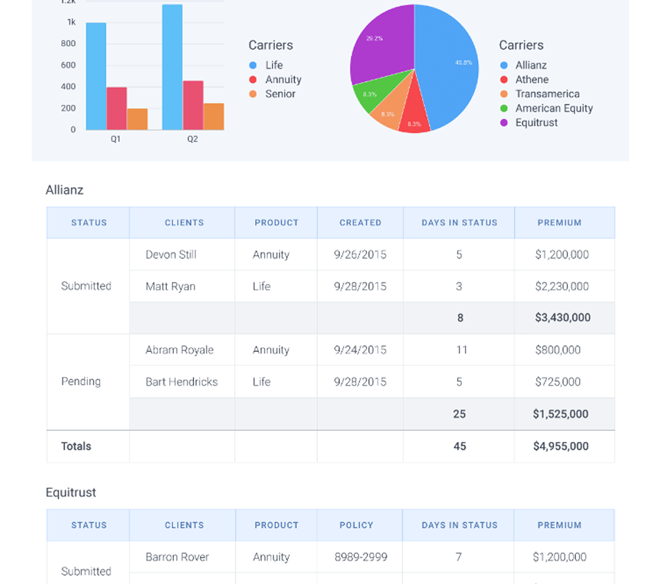
"Agents didn’t need more data. They needed a clearer, faster way to understand the data that mattered most."

The Objectives

Centralize Critical Information

Allow agents to access key policy insights directly within Broker Cloud without relying on external systems.

Prioritize Actionable Data

Surface the most important metrics first, helping agents quickly understand performance and identify opportunities.

Encourage Goal-Oriented Engagement

Create lightweight gamification elements that motivate agents through goal tracking and year-over-year production visibility.

The Solution

Design Solutions

Transform Complex Data into a Scannable Experience

The dashboard was designed to give agents a quick, actionable snapshot of their performance and policy activity

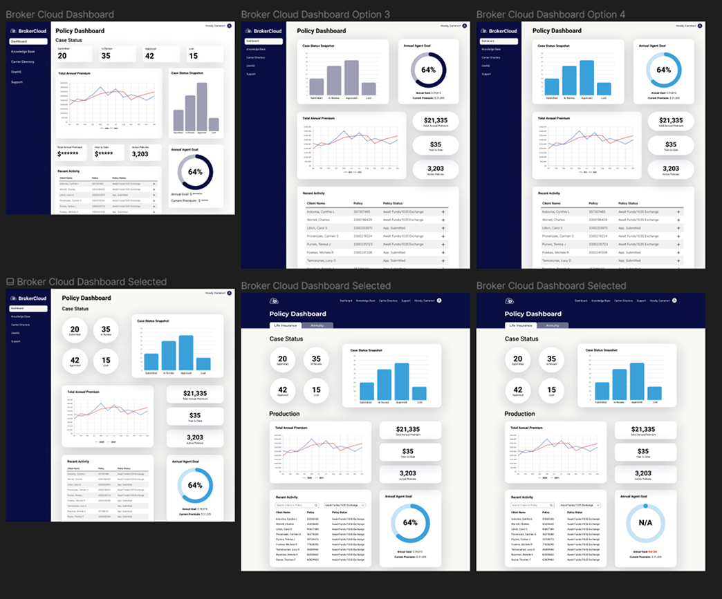
Key dashboard features included:
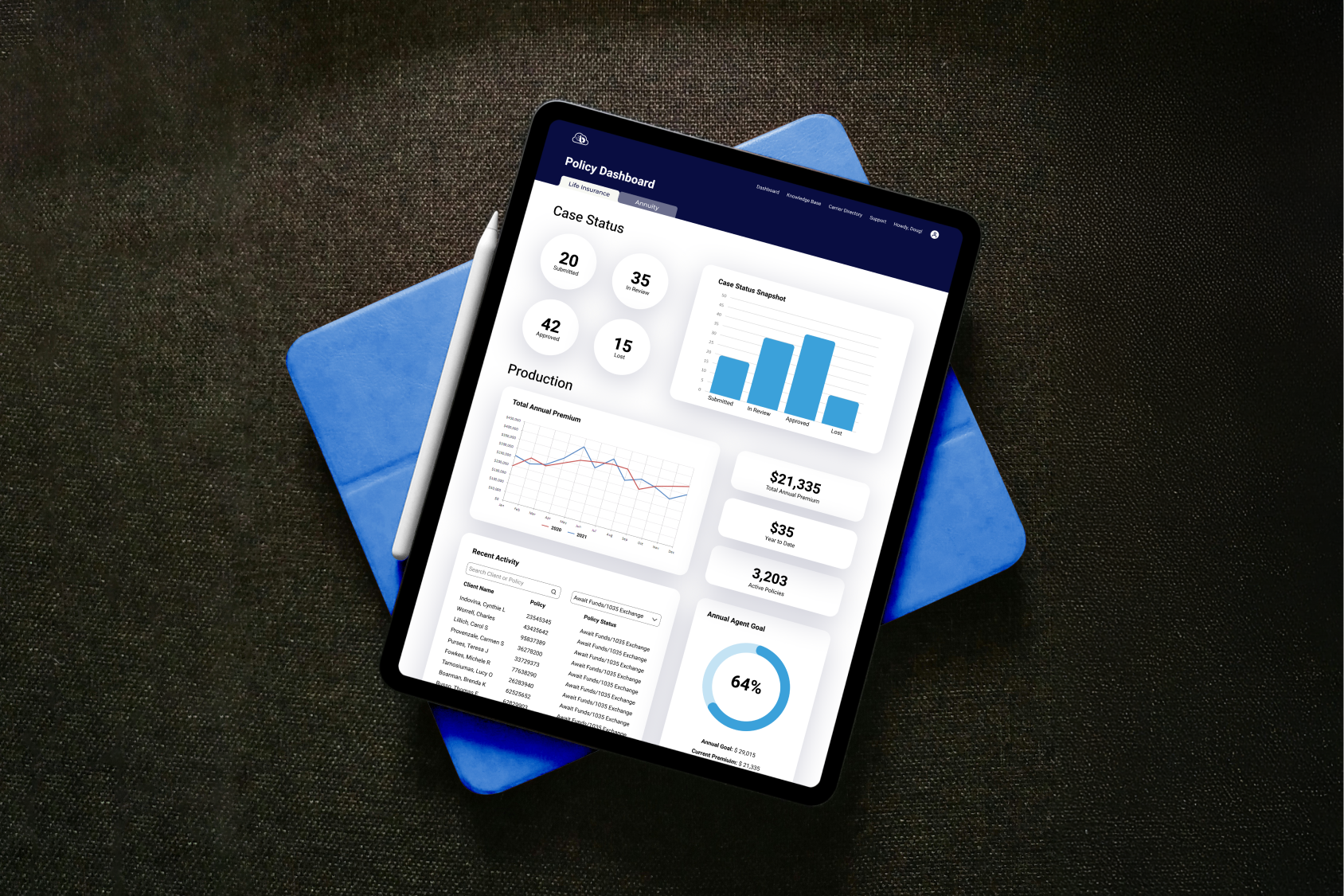
Life Insurance and Annuity case status tracking
Submitted, In Review, Approved, and Loss states
Case status visualization through bar graphs
Year-over-year production tracking
Total annual premiums sold
Active policy counts
Searchable and filterable recent activity
Annual goal tracking for agents
Design Solution 1:

Prioritized Information Hierarchy

The dashboard was structured to surface the most important insights first.

This helped agents:

Quickly understand performance
Identify important updates
Reduce time spent searching for information

The focus was not simply displaying data, but making the right data immediately actionable. The previous overviews were broad and didn't give immediate insights needed.

Design Solution 2:

Simplified Navigation & Workflow

To improve usability and scanning:

Added searchable recent activity
Introduced filtering and tabbed views
Consolidated information into a single centralized page

This reduced the need for agents to navigate across multiple systems or screens. Allowing for multiple options helped increase stakeholder involvement and decision making.

Design Solution 3:

Goal-Oriented Dashboard Design

To increase engagement and motivation:

Introduced annual goal tracking
Added year-over-year production comparisons
Visualized progress through charts and graphs

These elements encouraged agents to better track productivity and performance over time.

Conclusion

Key Takeaways

This project reinforced the importance of designing enterprise experiences around clarity, prioritization, and usability rather than simply displaying large amounts of data.

Balancing business requirements, stakeholder goals, and complex information architecture required thoughtful collaboration and a strong focus on helping users quickly understand what matters most.

1. Dashboards Should Prioritize Decisions, Not Just Data

Effective dashboards help users quickly understand what matters most instead of overwhelming them with information.

2. Information Hierarchy Drives Usability

Clear prioritization and visual structure are critical when designing for data-heavy experiences.

3. Lightweight Gamification Can Increase Engagement

Goal tracking and progress visibility helped create a more motivating and engaging experience for agents.

4. Simplicity is Essential in Enterprise UX

Reducing clutter and consolidating workflows created a significantly more usable experience without sacrificing functionality.