


The original Digital Key release didn’t fail just because of performance. It failed because it felt unreliable, hard to access, and unfamiliar, making users hesitant to trust it.
The redesign focused on three principles:
Impact:
This pattern leverages familiar interaction models seen in other mobile apps, increasing usability through recognition.
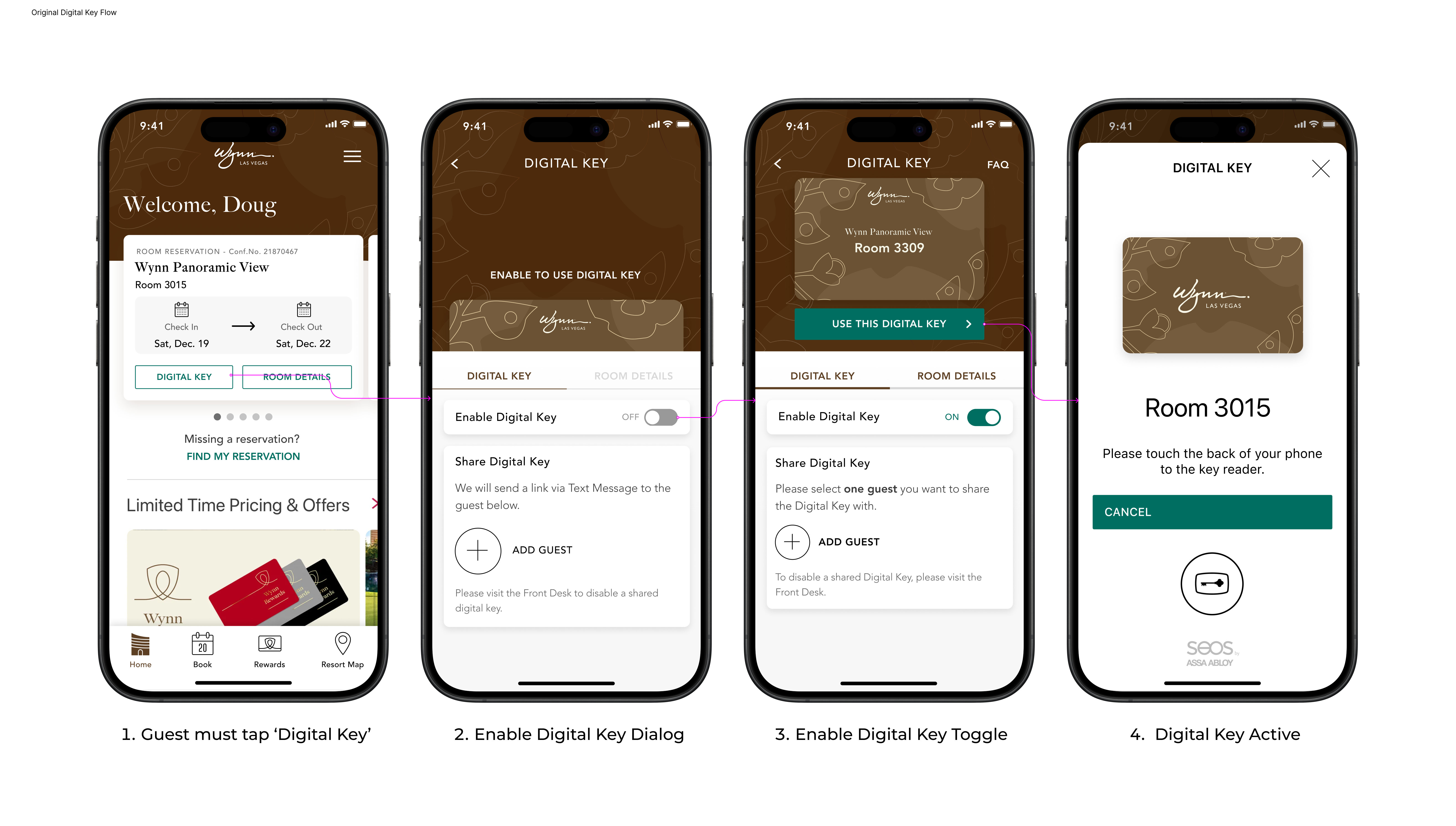
Before
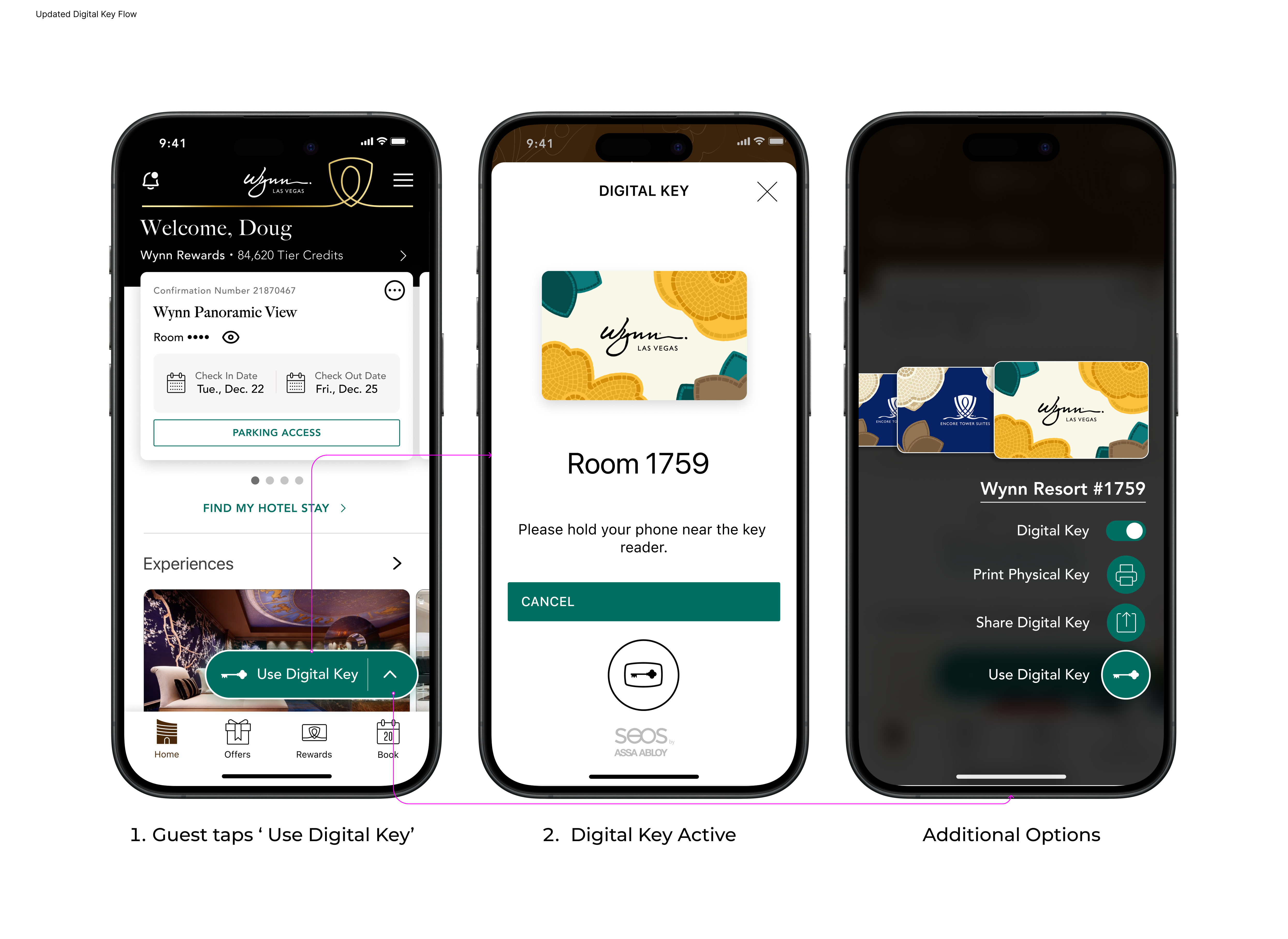
After
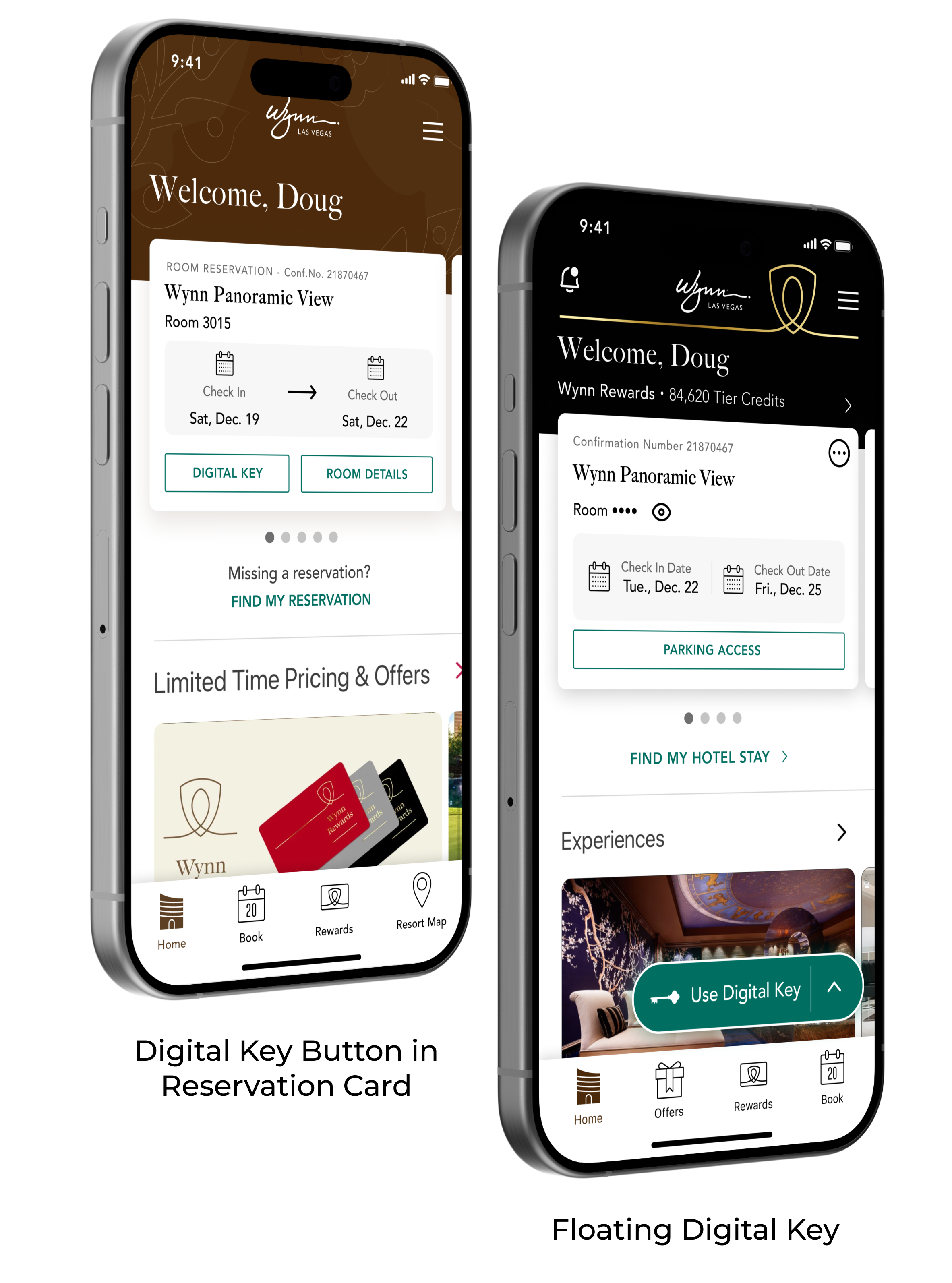
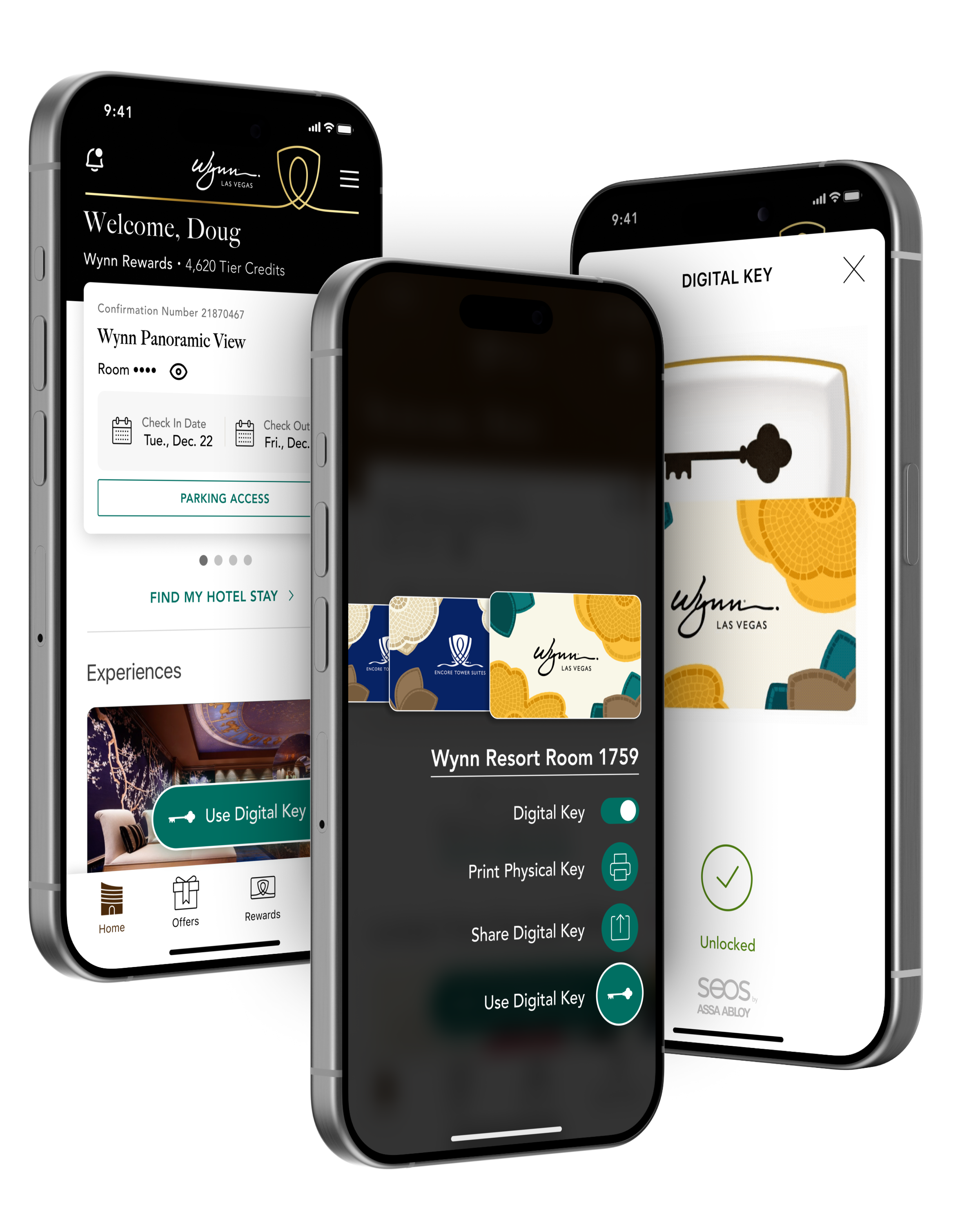
This changd the experience that was pulled from production that was a multi-step process into an instant utility.
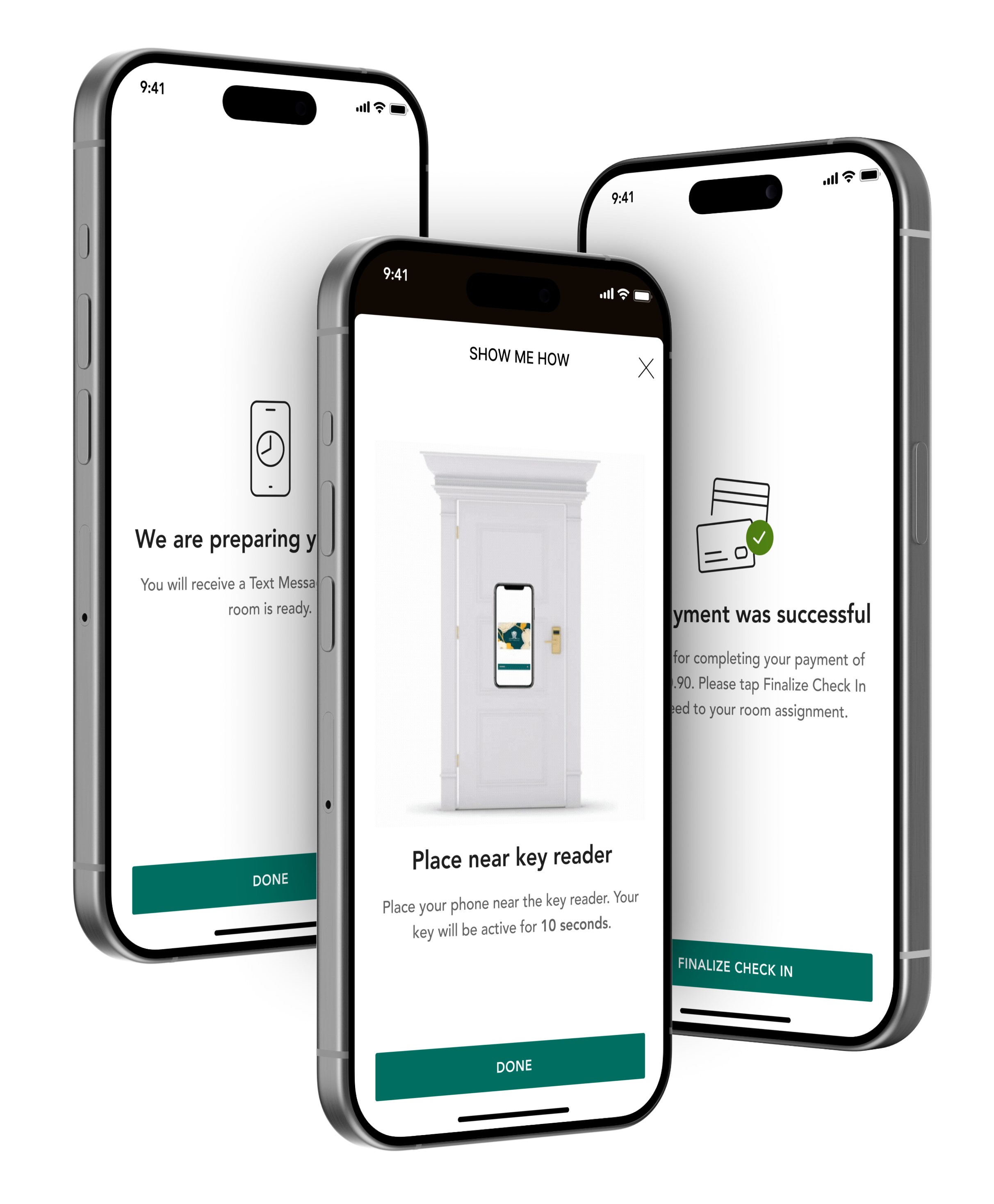
The redesign introduced targeted usability solutions:
Key improvements:
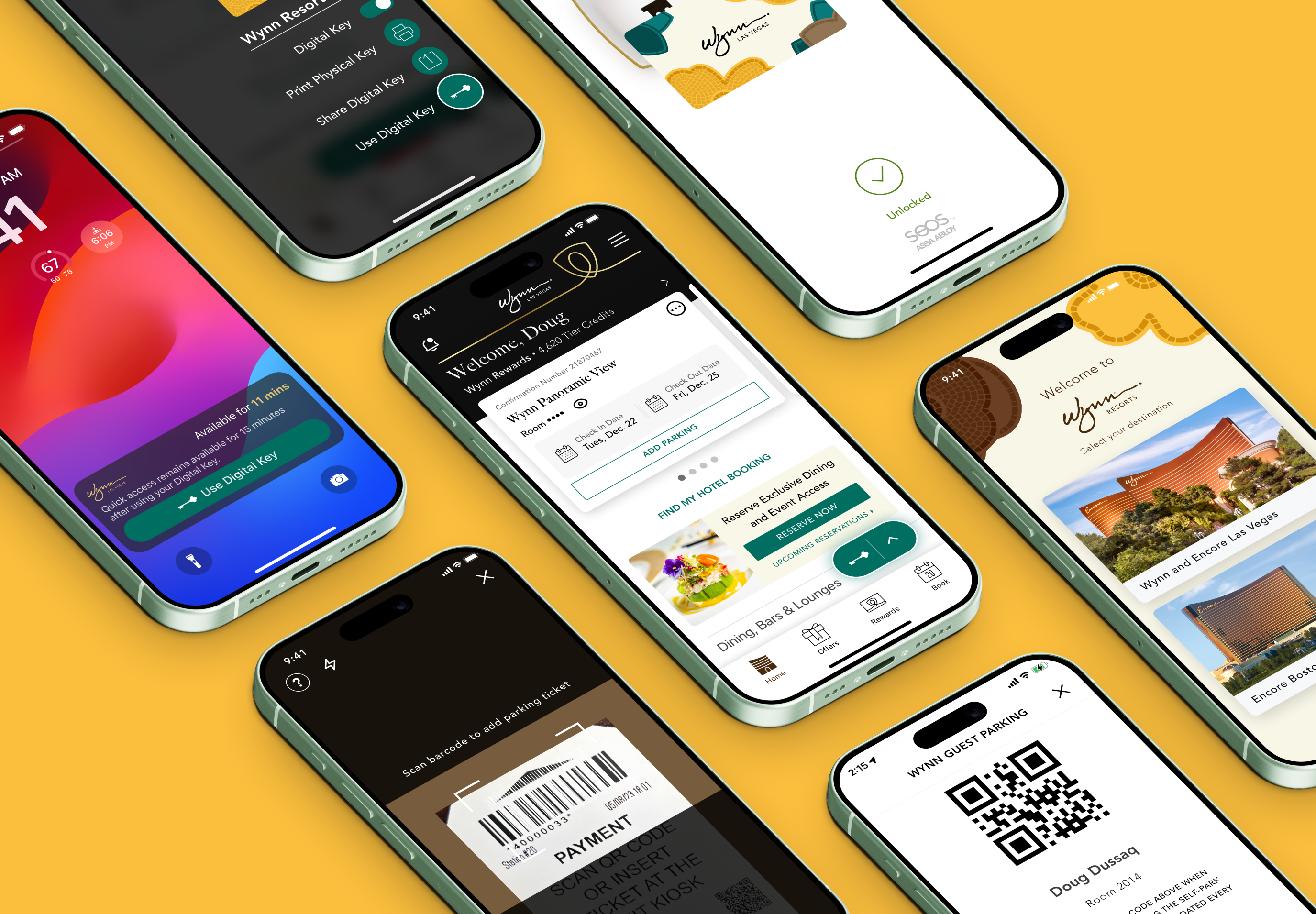
Key improvements:
A clearer visual hierarchy guided users through their stay journey.
To better understand how the Digital Key experience fit into the broader guest journey, I mapped the end-to-end experience from pre-stay through post check-out. This helped identify key moments where guests interacted with the mobile app, as well as gaps in usability, visibility, and system feedback.
Through this exercise, it became clear that the Digital Key was too buried within the experience and required too many steps to access—especially during critical moments like room entry. This reframed the opportunity: simplify the journey and make the key immediately accessible when guests need it most.
The updated journey map reflects a shift toward a more streamlined experience, where the Digital Key is easier to find, faster to access, and better integrated across the entire stay.

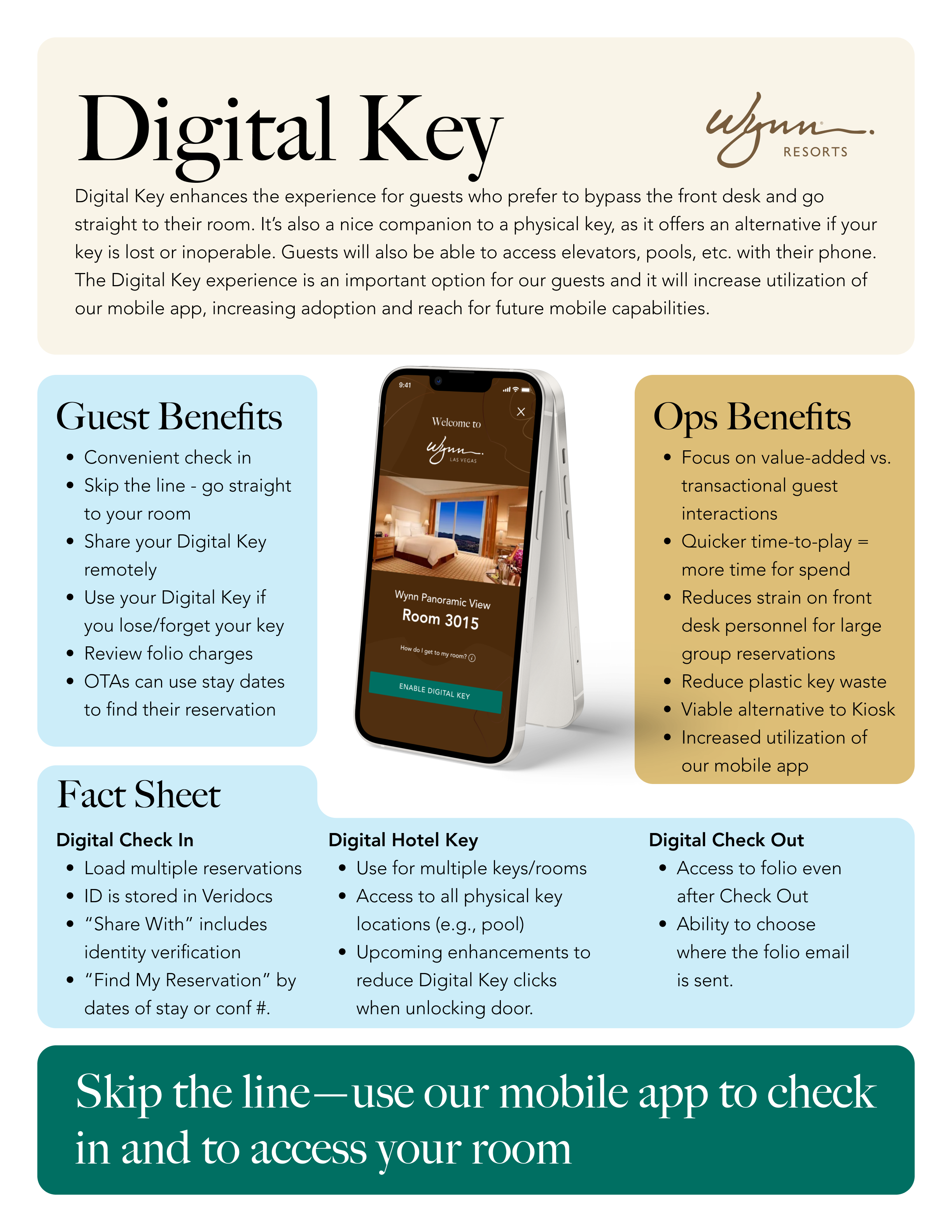
After an unsuccessful first launch, we introduced a simple one-pager to align front desk and call center teams on how to support and communicate the Digital Key Suite. This became a turning point—driving stronger internal buy-in, smoother customer experiences, and a clear shift in how the mobile app was perceived
Future opportunities include:
If you like what you see and want to work together, get in touch!
dougdussaq@gmail.com